The Power of Grids in Design

I’m a Product Designer with a clear understanding of technologies and the MedTech industry experience allowed me to seamlessly collaborate with developers and agile-driven teams.
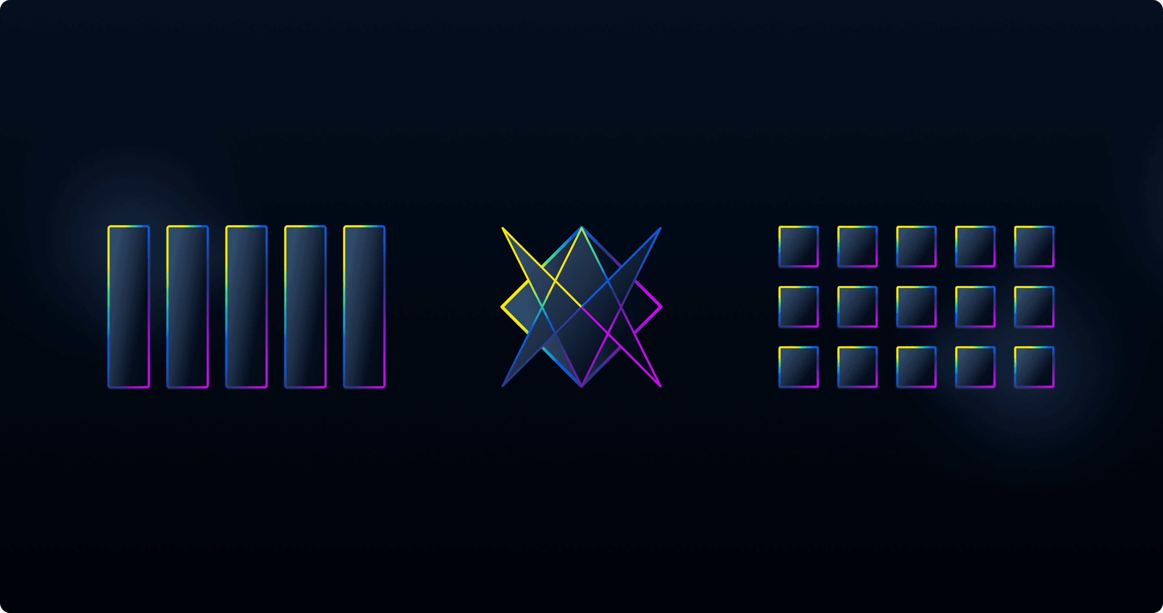
When we think about the most impactful designs, whether in print, web, or user interfaces, we often notice a balance and harmony that makes the design attractive and functional. This balance is rarely achieved by accident. Behind these aesthetically pleasing and functional designs lies a powerful tool: the grid. While grids are merely tools in a designer’s toolkit, their power in creating structured, consistent, and user-friendly layouts cannot be overstated. Let’s dive into four types of grids and see how each brings unique strengths to the design process.
Grids are not just about placing elements in boxes; they are about understanding the relationships between them and creating a visual hierarchy that naturally guides the viewer’s eye through the content. They simplify the design process, allowing designers to focus more on creativity and less on alignment issues. Furthermore, grids are essential for responsive design, ensuring layouts adapt smoothly to different screen sizes and devices.
Let’s explore different types of grids that demonstrate their power and versatility:
Columns

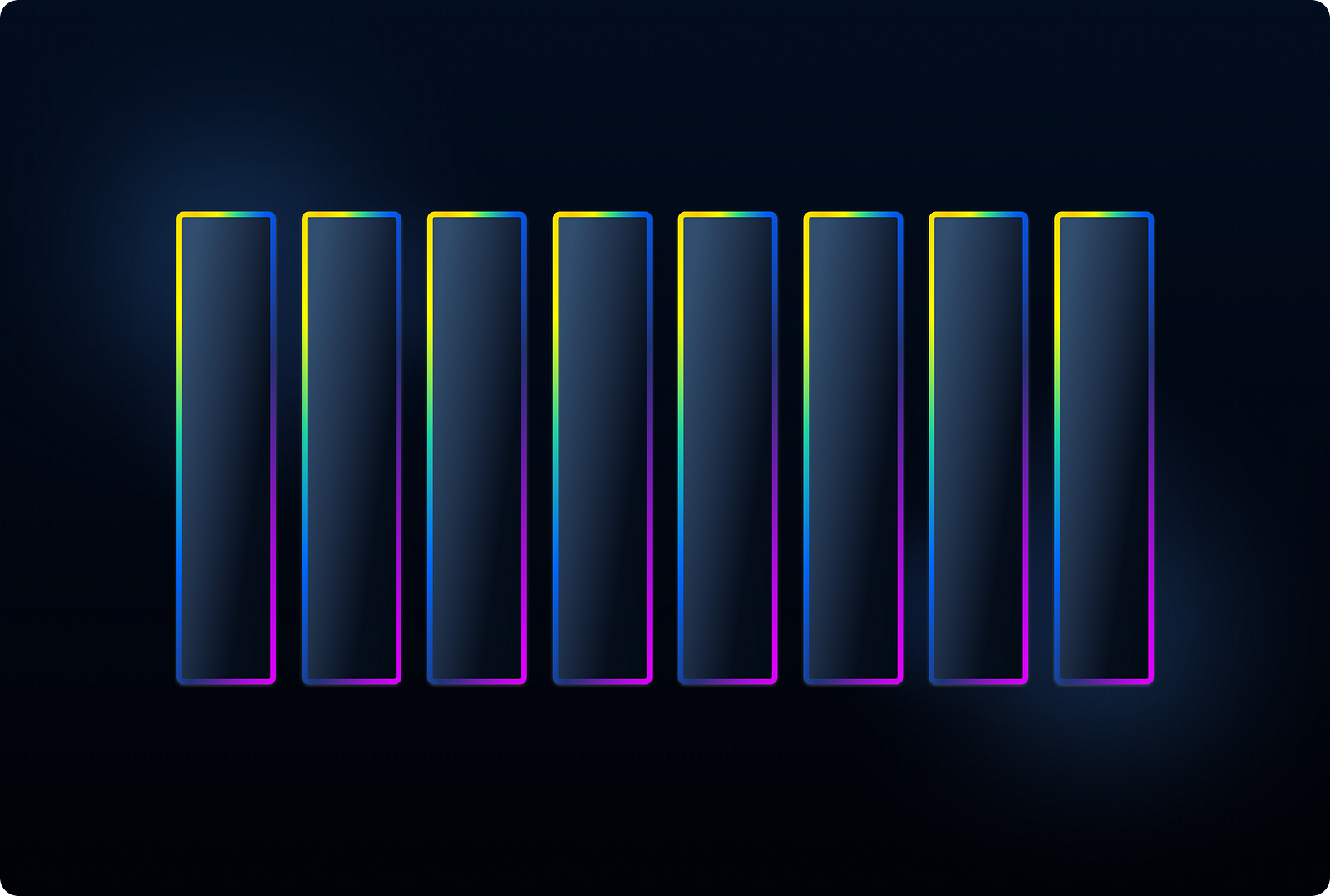
It is a fundamental layout structure in design, dividing the design space into vertical columns that create a flexible and adaptable framework. These grids are widely used across various design mediums, including web, print, and app interfaces, due to their ability to maintain alignment, consistency, and balance. By combining column grids with padding systems and typographic grids based on line height, designers can ensure that elements are well-spaced and readable. This structure is crucial for creating responsive designs that adjust seamlessly to different screen sizes, making column grids an essential tool for delivering a cohesive and visually appealing user experience.
Usage
Column grids are extensively used in web design frameworks like Bootstrap, where a 12-column grid system allows for complex and responsive layouts. This system ensures that content scales appropriately across various devices, from mobile phones to desktop computers.
Van De Graaf Grids

Van de Graaf Grids, also known as Golden Canon grids, are based on classical proportions and are highly effective in UI design for creating balanced and aesthetically pleasing layouts. These grids help establish a harmonious visual hierarchy, crucial for enhancing user experience and adapting easily to different screens, often inspiring design decisions. To use this grid, draw lines at the intersections to achieve 40–100 margins from the screen edges, and focus on key “power lines” to guide your design. This method ensures content is well-aligned and spaced, making interfaces more intuitive and visually coherent. It streamlines the design process and aids in creating responsive designs that adapt seamlessly across various devices, ensuring consistency and ease of use for the end user.
Usage
Van de Graaf grids are used in book and editorial design, helping designers create layouts that are not only beautiful but also enhance the reader’s experience by ensuring optimal readability.
Rectangular Grids

Rectangular or Modular grids are highly structured, dividing the design space into a matrix of rows and columns. The modules’ size and proportion create horizontal and vertical grids; smaller modules are preferable for less content, while larger ones are better for more content. Use some modules to create gutters. This grid type offers significant variability and detailed organization. When using many modules, highlight the main power lines for better clarity and emphasis.
Usage
Rectangular grids are commonly used in interface design for dashboards, data visualizations, and forms. They help in arranging elements like charts, tables, and input fields in a clear and structured manner.
Other Grids
Beyond the commonly used grids, there are various other types like asymmetric, round, or diagonal grids.
We’ve grouped all other types of grids into this category, including asymmetric, round, and diagonal grids. The primary purpose of any grid is to help structure information. Focus on your idea and composition first, using the grid as a tool to organize your concepts. The design concept can significantly alter a standard grid, and on some pages, it might be necessary to deviate from the site’s usual grid if the concept demands it. By combining non-standard and standard grids, you can create a visually interesting site without sacrificing usability. Remember, a grid is just a set of guidelines for organizing content — don’t take it too rigidly.
Usage
Asymmetric grids add a dynamic look, round grids are useful for specific layouts like clocks, and diagonal grids bring movement and energy to the design.
The grid system is a way to create order, but the real creativity comes from knowing when to break the rules.” — David Carson
Conclusion
Grids are invaluable tools in design, providing the necessary structure to create cohesive, functional, and visually appealing layouts. Each grid system offers unique advantages, from the versatile Column Grids to the classical Van de Graaf Grids and the structured Rectangular Grids to various unconventional types. Column Grids ensure consistency and adaptability, Van de Graaf Grids bring harmony and balance, Rectangular grids provide detailed and adaptable frameworks, while non-standard grids like asymmetric, round, and diagonal grids allow for creative flexibility. By understanding and effectively using these grids, we can streamline our workflow, enhance user experience, and craft innovative and user-friendly designs. Ultimately, grids are guidelines to help structure your ideas, allowing for a mix of creativity and usability.


